Clients with only an excellent idea for their printed material but no designer to turn it into a printable file can ask our designer to help them. She is available from Monday until Thursday. Contact details:
NAMING FILES
Files should be named clearly, comprehensibly and accordingly to the particular order.
For example: (Client_Magazine_A4_pg32-4.pdf) or (Client_Businesscard_2sided_100EX.pdf).
Multi-page files should have page number range in its filename and an underscore “_” must be used to separate words.
For example: (003-064_Magazine_A4_80pgs_CONTENT.pdf) or (001_Magazine_A4.pdf).
If, for some reason, there is a need to send a new, amended file to the printing house, the word ‘NEW’ should be added to the beggining of the file name. (NEW_OldFileName.pdf)
The file name must not contain language specific letters or symbols (+, -, /, #, !, (, õ, ä, ö, ü, é, å, etc)
BLEED
3-5 millimeters of bleed must be allowed on each side of the page. Bleed does not need to be added to the inner edge of staple bound notebooks.
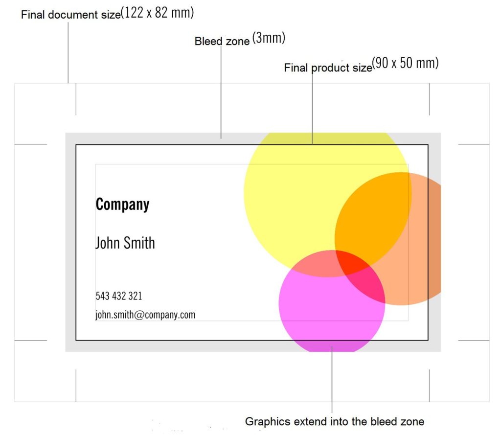
The crop marks or the lines marking the fold or perforation must not be in the bleed zone or closer than 3mm to the intended finished product.
THE RESOLUTION OF IMAGES (DPI)
The resolution of objects using raster graphics must be 300-400 dpi in 1:1 size. In special cases such as blurry backgrounds or posters in larger formats, the resolution can be lower, but not less than 150 dpi. The resolution for bitmap images must be 1200 dpi.
A resolution that is higher than required does not increase the quality of the image, but increases the file size and makes processing the images slower.
TEXTS, FONTS
All typefaces (fonts) used in the design must be included in the PDF file (As Embedded). If embedding a typeface in the PDF file is unsuccessful, all text using that typeface must be converted to objects.
White text (knockout) with a size of 8pt or less (height less than 3mm and weight less than 0.3mm) should not be used within a color space. Neither should any lighter-coloured texts.
Text in cursive or with serifs within coloured objects must at least 10pts large. Placing white text within a raster surface lighter than 50% or in a yellow surface should be avoided in order to make sure there is contrast.
In all cases, text based on vector graphics is preferred and converting text to images (pixels) should be avoided.
COLOUR IN CMYK
The orders to be printed with the four CMYK colours must not contain Pantone, RGB, Lab or other such tones. All coloured images must be in CMYK and Grayscale images must be converted to CMYK using a special GCR profile. Using the wrong profile may cause the grayscale image not to appear a neutral gray when finished.
The requirements based on the choice of paper must be followed. In case of images, this is provided by using the correct ICC profile, but in case of vector graphics, the designer must be assured that the amount of colour does not exceed the permitted limits, for example – C: 100%, M: 60%, Y: 100%, B 90% – the sum is 350%.
If the amount of colour is too large, the process of the ink drying on the printing paper is significantly complicated, which in turn causes the product to be stained in (post-processing/after-treatment) and later use.
The maximum amount of (paint/ink) in case of Gloss papers is 330%, in case of Silk and Matte coated papers, the largest amount of ink allowed is 300% and for uncoated papers the maximum amount of ink is 260%-300%. Using non printable percentage such as 1-3% and 97-99% in colour tones should be avoided.
Files that contain unacceptable colour tones (RGB etc) will be converted to CMYK automatically in the prepressing process using the ICC profile in accordance with the printing paper. The conversion is fairly accurate, but the colour tones of the finished products may differ from the preference of the client to some extent. Using custom Pantone tones should be avoided, becuase in this case, the automatic conversion may produce unexpected results. It is advised that all such conversions should be conducted by the creator of the file.
PAGES IN THE FILE
The pages in the file must be positioned as single pages, rather than side by side (as spreads). Empty pages without layout must be included and be placed in their proper spot as well. The file must not contain any unnecessary pages that are not meant to be printed.
The format of the page must be in 1:1 scale – the size of the design and the finished product is supposed to be the same.
CRITICAL OBJECTS
Texts and other critical objects must be placed at least 2mm from the edge of the product, in case of bound products, they should be placed at least 4mm from the edge of the page. This way, it is assured that these objects near the edges of the pages remain despite the inaccuracies of the technology used in cutting, folding and binding.
OVERPRINT AND BLACK
Graphical images must not be set to overprint, except for the colour black. Overprint may cause the colours to alter. For example, if a yellow object is set to overprint and placed on a blue background, the yellow will turn green. White objects that are set to overprint will disappear.
All 100% black objects are automatically set to overprint in the prepressing process. 1% of yellow has to be added to black objects if overprint is not intended.
Large black surfaces containing just black may become dull-coloured or a design element may be visible under the black surface. In order to avoid this, it is recommended to enrich large black surfaces. (C: 40%, M: 30%, Y: 20%, B: 100%)
In cases of smaller black texts and lines, rich black colours should be avoided, these types of objects should be 100% black.
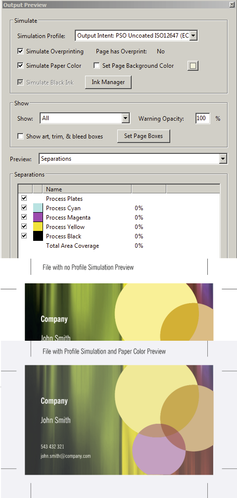
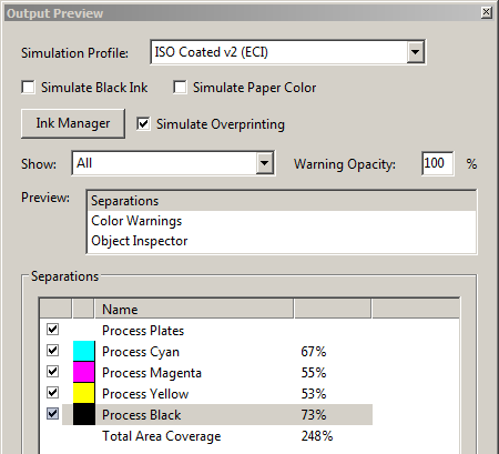
Overprint must be checked in a PDF file using AcrobatPro by selecting the ‘Simulate Overprint’ option int he ‘Output Preview’ dialog box. To check the colour black, the ‘Process Black’ checkbox should be unchecked.
METALLIC COLOURS
When using Pantone’s metallic colours, such as Silver (877) and Gold (871), one must pay attention to the fact that metallic colours are opaque, rather than transparent like regular printing colours. Metallic colours are always added last, therefore when placing black text on a metallic background, the black should not be set to overprint and 1% of yellow should be added to it.
BARCODE
Barcodes must be 100% black in order to assure legibility, either as vector graphics or as a bitmap image with a resolution of 1200 dpi.
A free service for creating barcodes can be found here: http://www.terryburton.co.uk/barcodewriter/generator/
Create the necessary barcode and save the image with the largest possible resolution. Then save the generated image file as a bitmap file using Photoshop.
PAGES POSITIONED SIDE BY SIDE
In case of images that span over two pages, one should be careful that no essential objects are placed over the back of the printed matter. This is especially critical in cases of perfect bound products.
In cases of perfect binding, we use PUR glue, as it allows for the product to be opened more easily and it ensures a stronger bind. Although in cases of less thick perfect bound products or products with more rigid covers, important objects should be placed ca 2-3mm further than intended from the inner edge of the page.
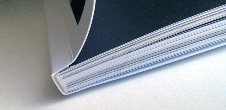
In order to acheive a stronger bind, the inner side of the covers are glued to the first and last page of the product with an adhesive strip of about 5 millimeters.
This is why placing important objects within the 10mm-wide ‘blind area’ should be avoided. Furthermore, in order to ensure a continuous image over two pages, both sides of the image should be placed about 5 mm towards the outer edge of the page.
COVERS AS PAGES
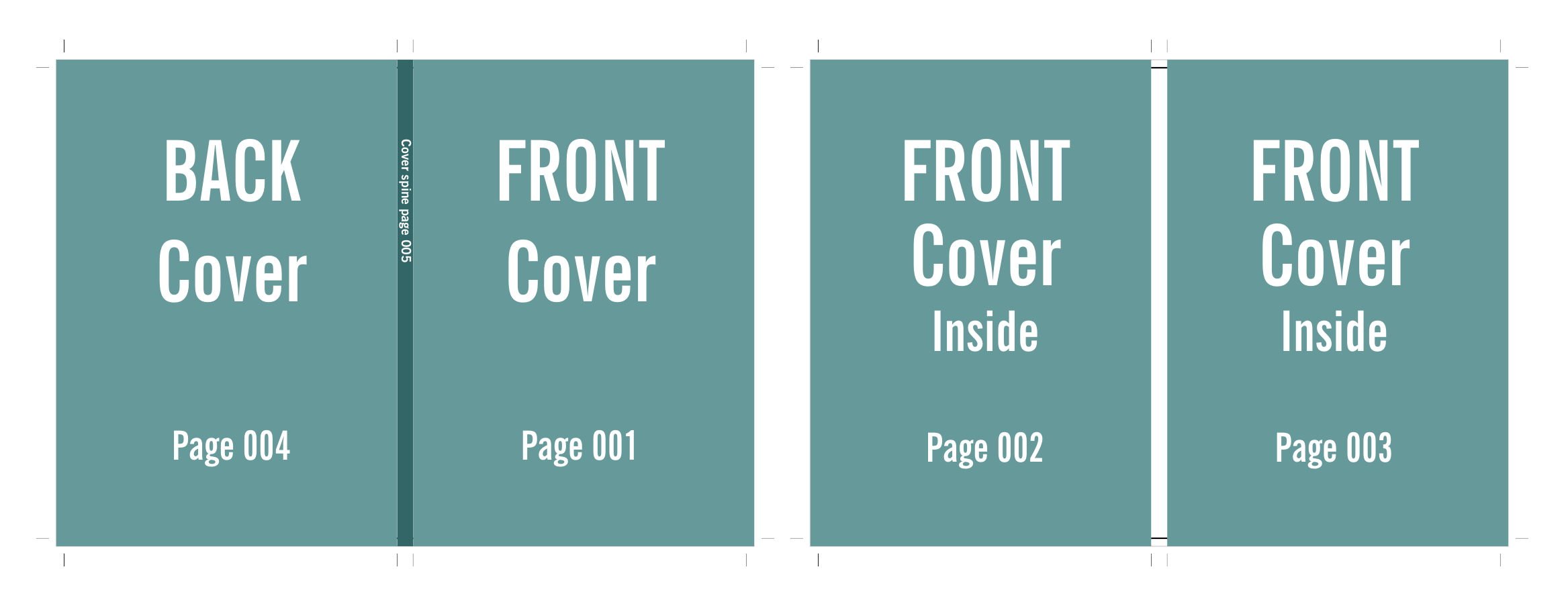
Covers count as pages as well, in case of saddle stitched products, the cover pages should be sent within the same file as the content pages.
In case of perfect binding, the cover files should be sent already laid-out, the cover pages and the spine of the product should be placed in one file and as intended. Thickness of the spine ask from your sales manager.
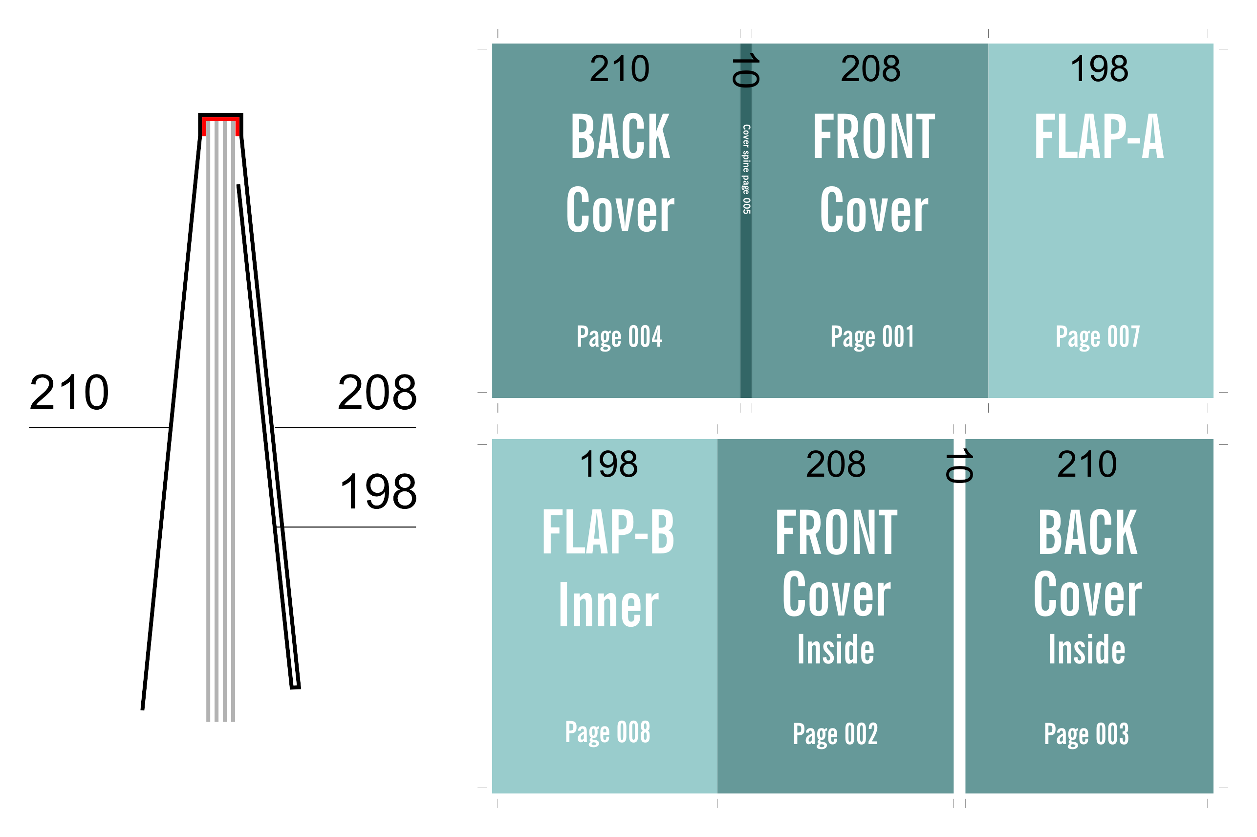
The format of the cover file in case of A4 size covers and a spine thickness 10mm would be (210+10+210) x 297 = 430 x 297 + bleed.
The cover with the flap should be at least 2mm shorter than the finished product. Furthermore, the flap itself should be at least 10mm shorter than the finished product.
DIE CUTTING
The die lines must be colour-coded – cuts should be marked with red lines, grooves with green lines and perforations with yellow lines. The die lines should be in Spot colours in the file. Furthermore, in order for us to be able to create the die cutter, a file that includes only the die lines and no design elements must be sent to us.
SPOT VARNISH
The intended spot varnish objects should be included in the product’s file as a spot colour object, or as a separate file.
LAMINATION, VARNISH
Lamination and UV varnish may change the colours of the finished product. Using glossy laminates and varnishes can result in the colours appearing slightly darker and certain tones may seem more red.
SOFT PROOF
A soft proof is a method of verifying the colours before printing. Adobe Acrobat Professional can be used to soft proof a PDF file. The colours of a file can be checked using an adequately calibrated monitor that is set in accordance with the brightness in the room.
In order to soft proof, ‘Output Preview’ must be selected in Adobe Acrobat Pro and in order to simulate the right colour tones, the Simulation Profile must be selected to match the printing paper. In case of uncoated paper (PSO_Uncoated_ISO12647_eci).
In addition to this, ‘Simulate Paper Color’ can also be selected. This will make the colours on-screen seem slightly dimmer than in the finished product, but it will give some idea of how colours change in the printing process.


